About the Artist
Work
Cover Arts
Clothing Designs
Branding
Poster Designs
Contact
About the Artist
Work
Cover Arts
Clothing Designs
Branding
Poster Designs
Contact
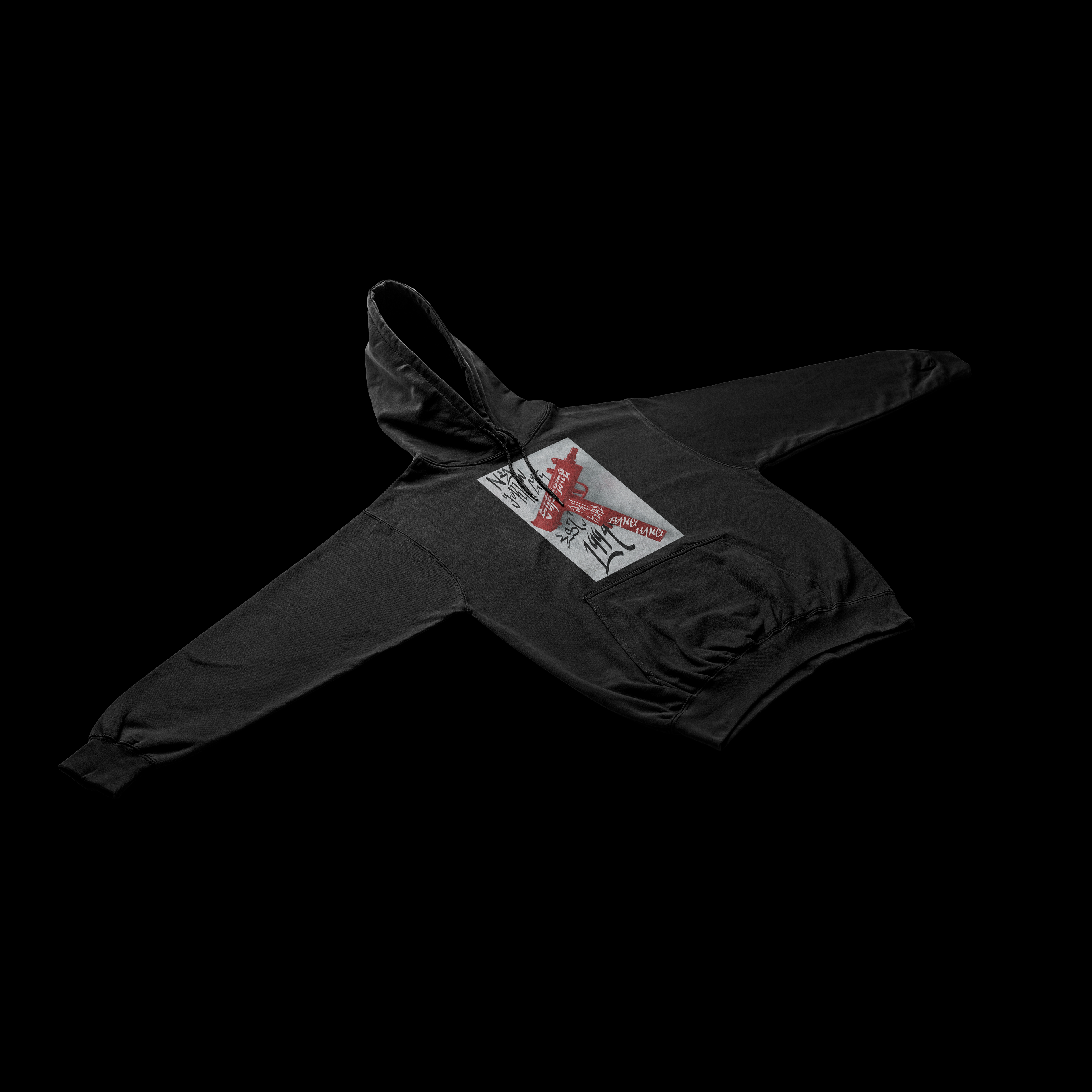
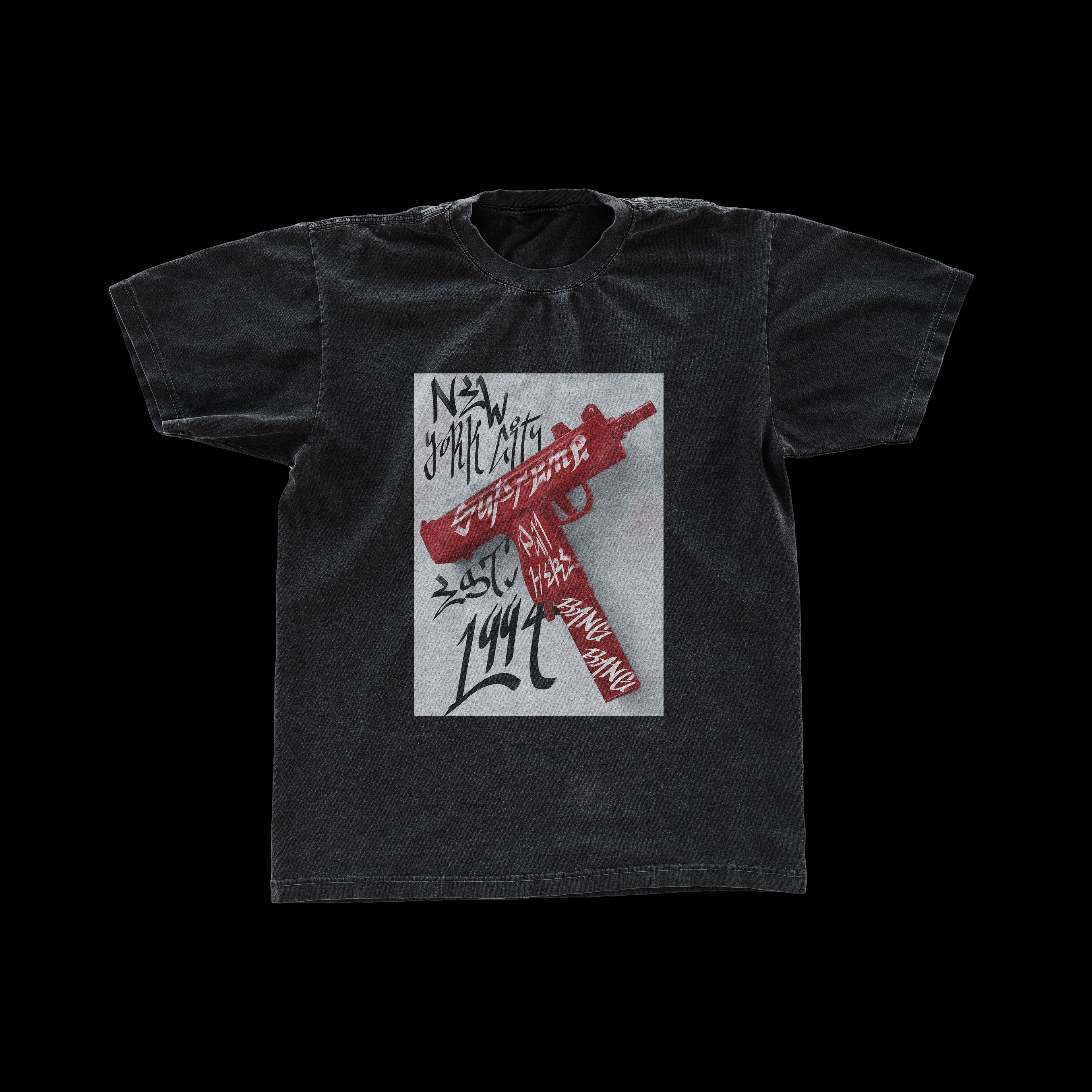
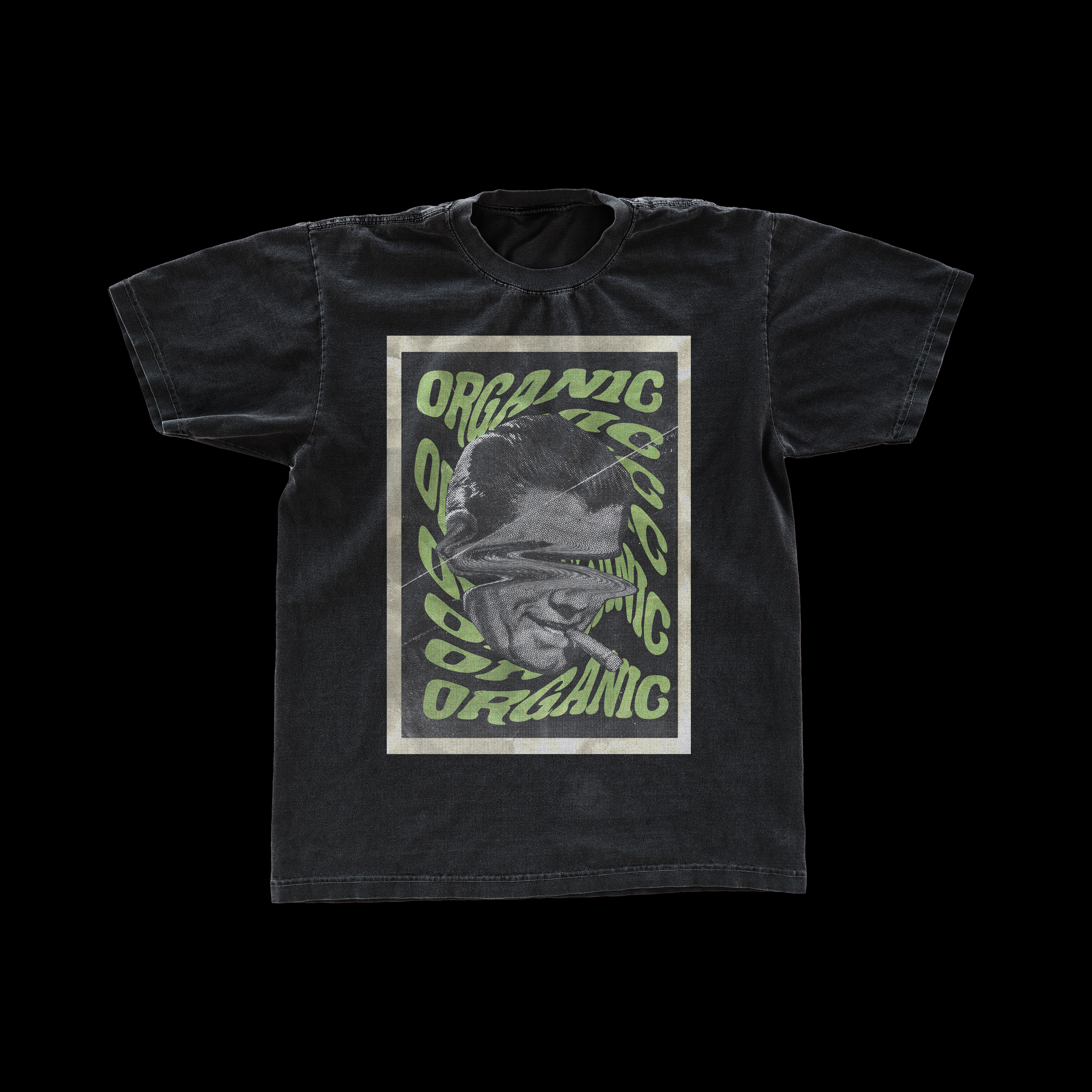
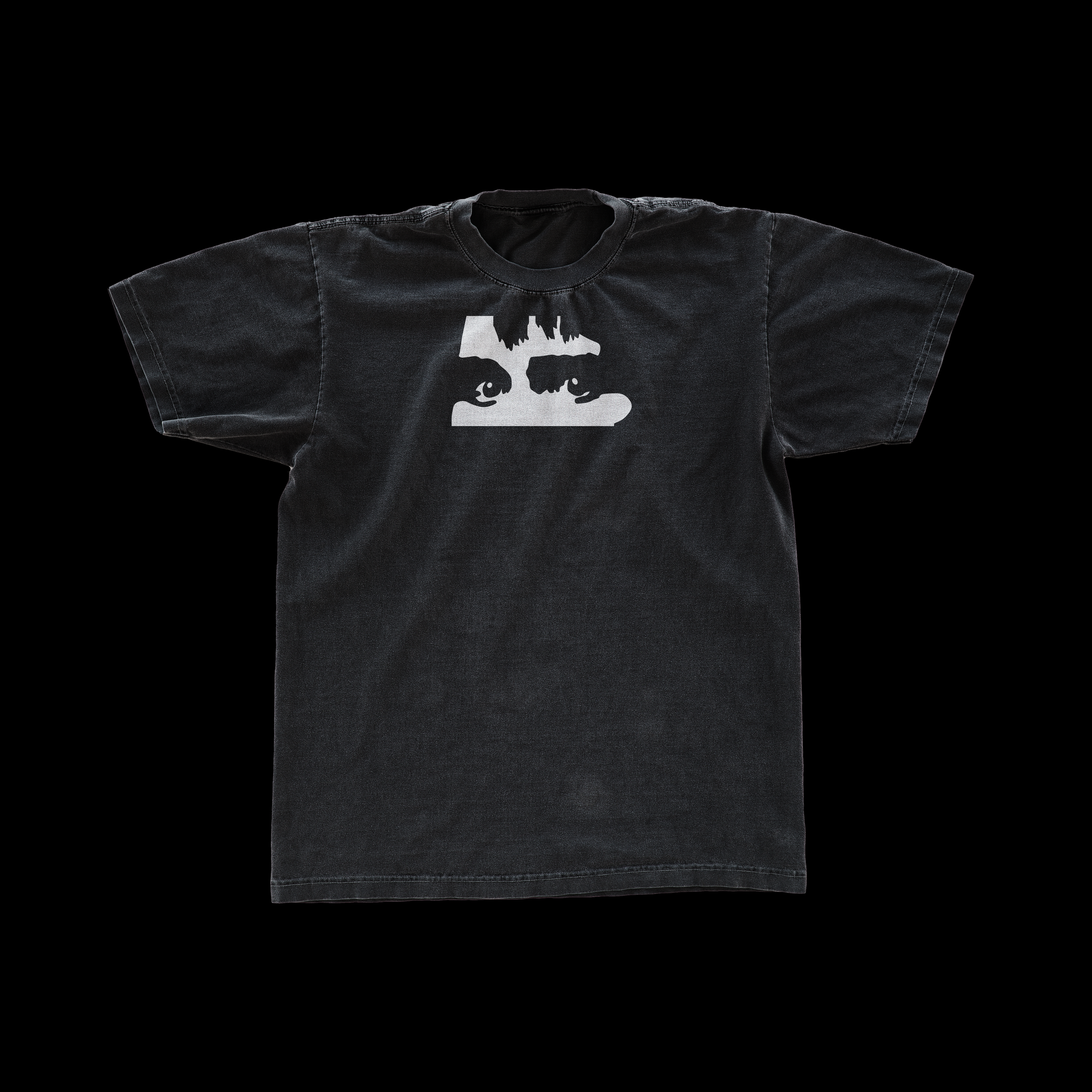
Clothing Designs
Supreme Concept Designs
Organic T-Shirt Design
SIGHMON Merch Designs
↑
Back to Top